
Creative, UI/UX, Website
Yamaha Acoustic Pianos
- Client
- Yamaha
- Industry
- Musical Instruments
- Services
- UI/UX DesignWeb DevelopmentIterative Design Exploration
- Live Page
- Open Project
Case Study
Fun enough for a first note. Luxurious enough for a flagship.
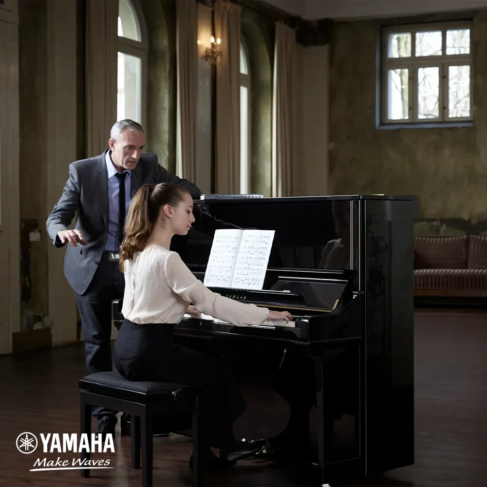
Yamaha returned with the launch campaign for its new acoustic upright pianos — a page that had to feel fun and luxurious in the same scroll. We explored fourteen full iterations to find that balance, and the design now fronts the campaign on my.yamaha.com.
01
The Challenge
Yamaha came back. After the New Primary Course page for Yamaha Music School, the team returned with a bigger stage: the campaign launch of its new acoustic upright pianos on my.yamaha.com.
The brief carried the same tension as the first one, only sharpened: the page had to be fun and luxury at the same time. An acoustic upright is the most serious purchase in a family's musical life — black lacquer, real hammers on real strings, a century of craft behind the nameplate. But this campaign speaks to families choosing a child's first piano, and a first piano is not a solemn object. It is bedtime songs and wrong notes and someone small refusing to stop playing.
The page had to make that first note feel like an event — without ever making the instrument it happens on feel like a toy.
02
The Approach
When a brief pulls in two directions, we don't split the difference on the first try — we map the territory between the poles. We designed fourteen full iterations of the page, each one a different settlement between fun and luxury: how warm and playful the campaign could get before the piano stopped feeling precious, how dark and lacquered before the family story went cold.
- Iteration 01
- Iteration 02
- Iteration 03
- Iteration 04
- Iteration 05
- Iteration 06
- Iteration 07
- Iteration 08
- Iteration 09
- Iteration 10
- Iteration 11
- Iteration 12
- Iteration 13
- Iteration 14
Every iteration was held up to the same three lenses before the next one was drawn:
Delight
Does the page carry the campaign's warmth — family film, playful movement, a first note that feels like an occasion?
Prestige
Does the instrument keep its weight — the lacquer, the craftsmanship, the calm typography a flagship Yamaha deserves?
Clarity
Does a parent always know the next step — which upright fits their family, and where to go and play one nearby?
Fun that costs the brand its gravity is a loss; luxury that freezes out the child is one too. The iterations kept both poles on the page at once and moved the line between them until neither side gave anything up.
03
The Solution
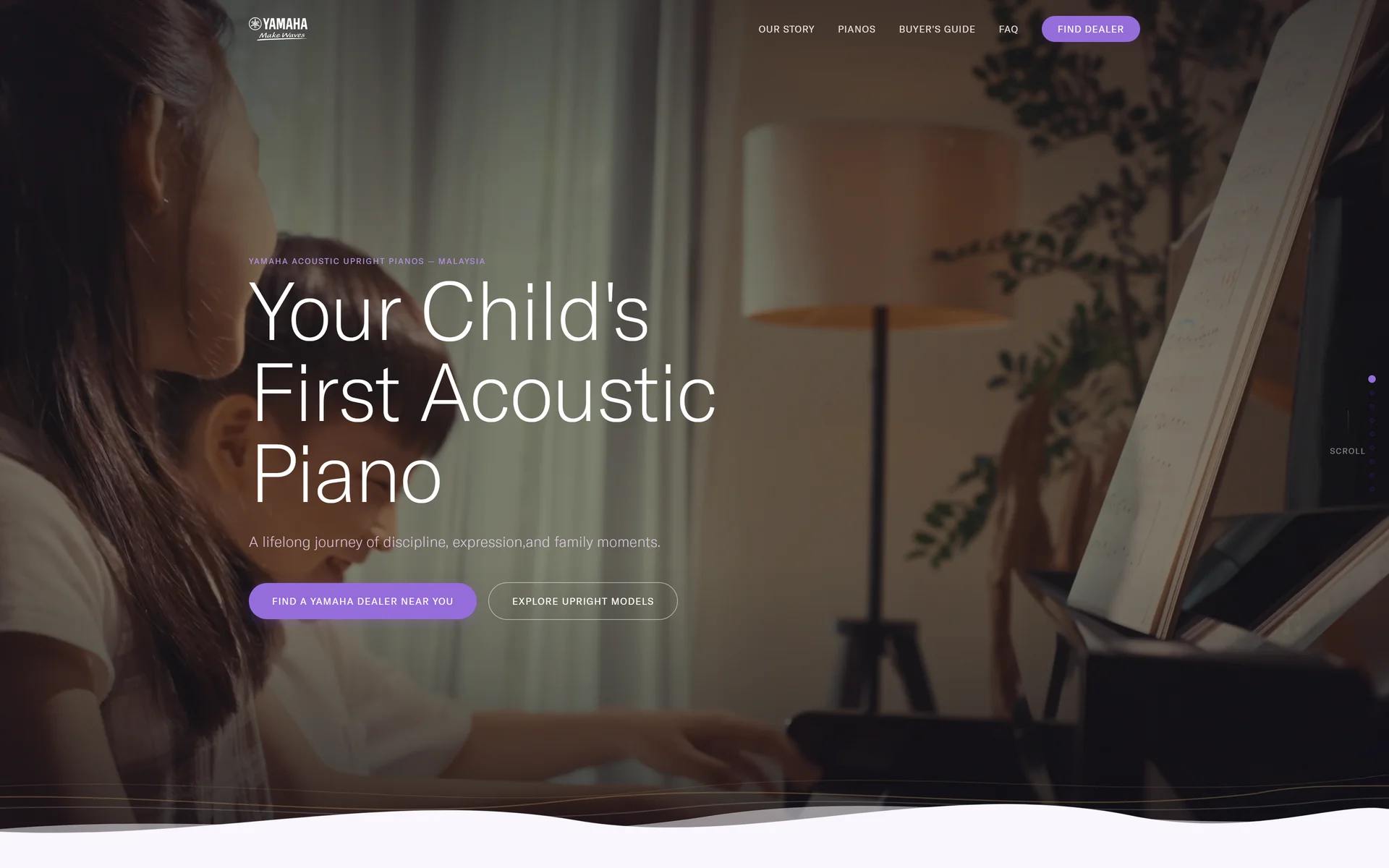
The direction that survived fourteen rounds opens as cinema. A full-bleed family film sits under a near-black wash; the headline — Your Child's First Acoustic Piano — is set in light, unhurried type; and the campaign's lavender does the pointing, one soft pill to find a dealer, one quiet outline to explore the models. Then the darkness breaks on a hand-drawn white wave, and the page turns light.
The luxury lives in restraint: deep charcoal panels for the B Series range, close-up craftsmanship photography, generous whitespace and a type scale that never raises its voice. The fun lives in motion and warmth: waves instead of hard section edges, hand-drawn musical notes drifting through the backgrounds, film stills of parents and children where product renders would have been the safe choice.
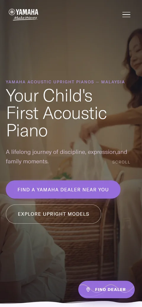
Between those two registers, the scroll makes one continuous argument — why an acoustic piano teaches more than music, a parent's guide to choosing a first instrument, the upright families side by side, the Yamaha tone, the craft behind it, the questions parents actually ask, and voices from families further down the road — ending at a showroom finder, so the story can finish at a real keyboard. The same system compresses to a phone without losing either register: the film, the wave, and a floating Find Dealer pill that never leaves the thumb's reach.
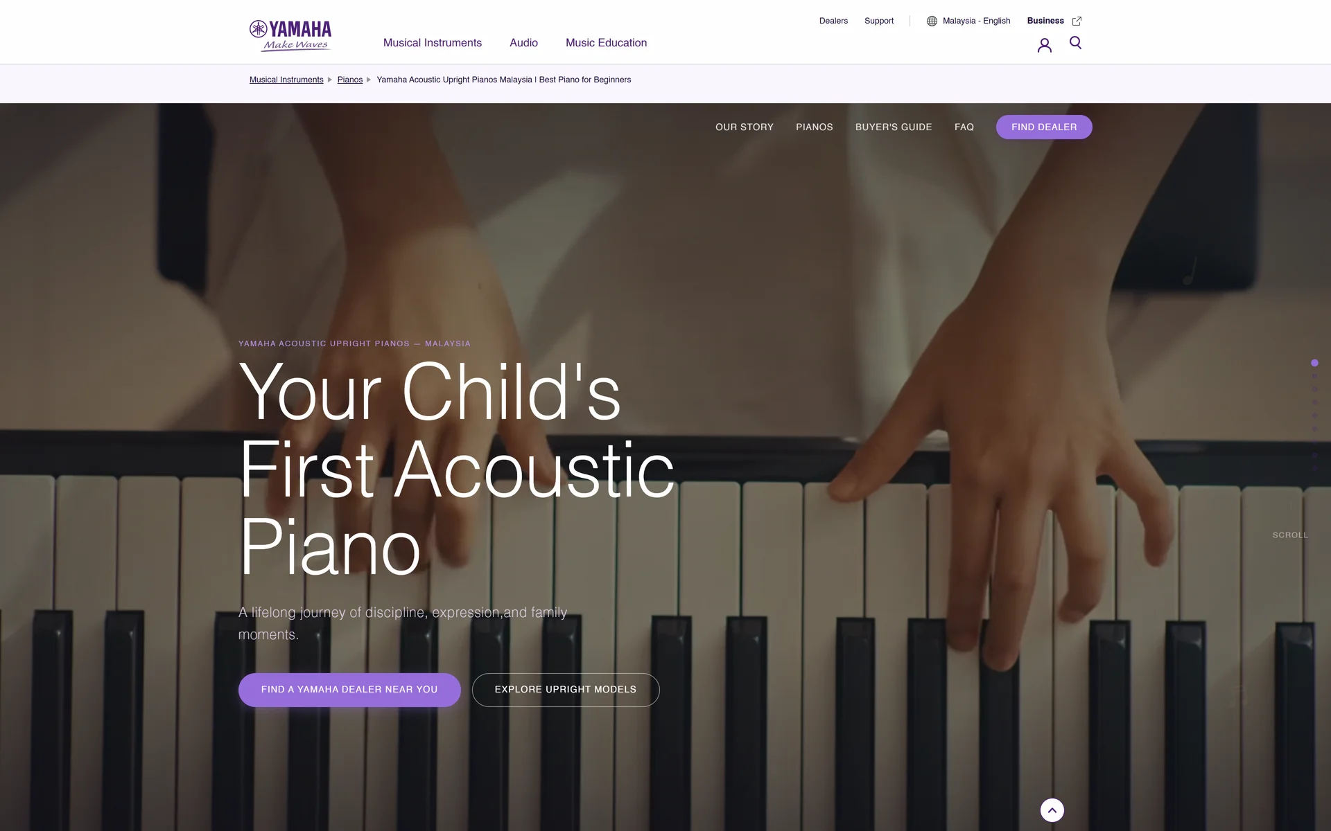
And it shipped: the design now fronts Yamaha's acoustic upright piano campaign on my.yamaha.com, sitting inside the brand's global site chrome.


Collaboration
Got a project?
Let's talk.
We're a team of creatives who are excited about unique ideas and help companies to create amazing identity by crafting top-notch UI/UX.