
Ysé
- Client
- Ysé
- Industry
- Lingerie & Swimwear
- Services
- Art DirectionUI/UX DesignWeb Development
- Live Page
- Open Project
Case Study
Intimacy, at the scale of a storefront.
Ysé designs lingerie and swimwear around real bodies and an unhurried, self-possessed idea of femininity. Carrying that intimacy onto a website — warm and personal, never clinical — was the heart of the work.

01
The Challenge
Lingerie is the most personal thing a brand can sell, and the easiest to get wrong online — where product grids tend to flatten everything into inventory. Ysé's whole proposition, founded in 2012 by Clara Blocman and Bérengère Lehembre, is warmth: pieces made to celebrate real bodies, spoken about with care rather than sold at.
A storefront had to hold that tone at scale — staying soft and human across lingerie, swimwear and ready-to-wear, and across the constant churn of seasonal newness.
02
The Approach
The work was led by art direction — the palette, the photography and the pace that make Ysé feel like Ysé — then built into a system that keeps that feeling consistent as collections change.
Three principles anchored it:
Warm, not clinical
A soft, neutral palette and intimate photography that treats the body as something to celebrate, not merchandise.
Collections as stories
Present seasonal edits as mood-led narratives, so browsing feels curated rather than transactional.
Considered femininity
A calm, confident tone carried through type, spacing and imagery — free, never fussy.
03
The Solution
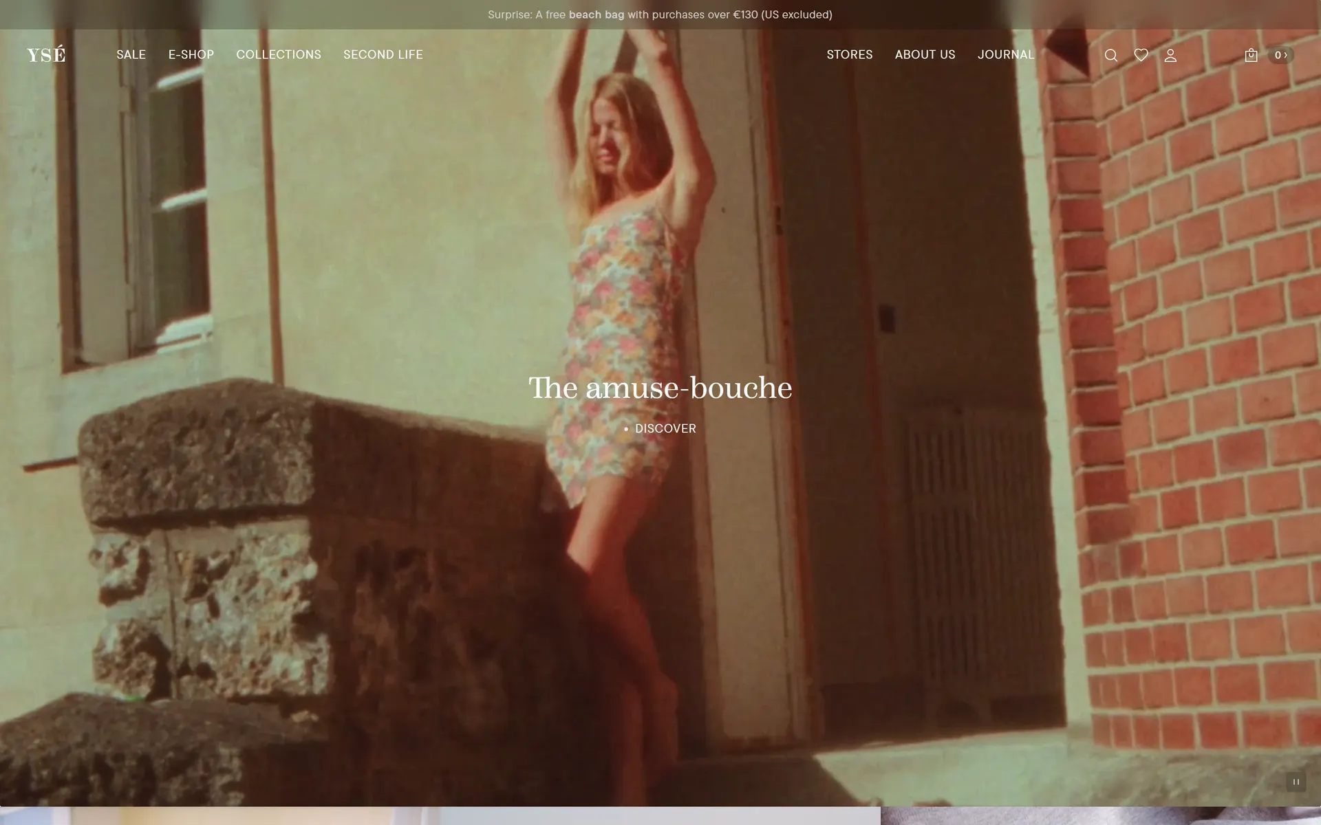
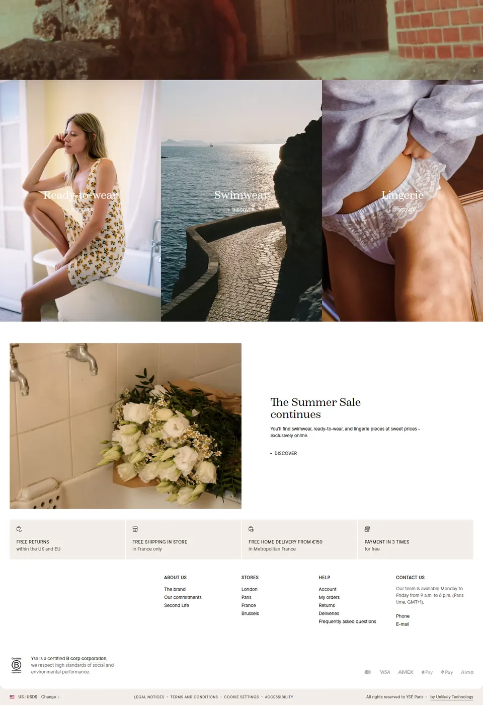
The storefront leads with atmosphere: warm neutrals, natural light and unhurried, almost cinematic photography that lets each collection read as a story before it reads as a shop. Lingerie, swimwear and ready-to-wear sit in clean, generous frames, and the brand's values — a certified B Corp, with a Second Life resale programme — are present without ever crowding the clothes.
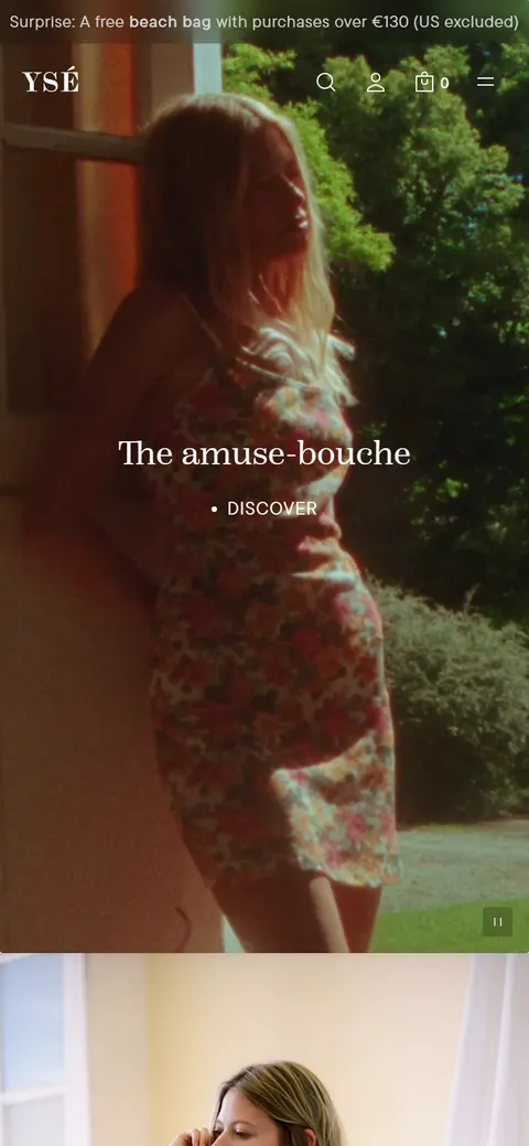
On a phone the warmth carries over intact: a single, gentle column where imagery leads and the shopping never feels clinical.
04
The Impact
The result is a storefront that feels the way the brand sounds.
-
Personal at scale. A system built around warmth keeps every new collection feeling intimate, not inventoried.
-
Story before sale. Mood-led presentation invites browsing, so shopping happens as a consequence of feeling rather than friction.
-
Consistent and calm. The same considered femininity reads on every screen and through every season.

Collaboration
Got a project?
Let's talk.
We're a team of creatives who are excited about unique ideas and help companies to create amazing identity by crafting top-notch UI/UX.