
Case Study
A property brand that opens the door before the viewing does.
Bindal Homes sells high-end homes in Gurgaon — the kind of decision buyers make long before they ever step inside. We built the brand and the website that make that first impression: an editorial, appointment-led experience where luxury real estate feels considered rather than sold.
01
The Challenge
Luxury real estate is a trust business before it is a property business. At this end of the market, a buyer sizes up the firm long before they consider a listing — and a single flat, generic web page can quietly undo years of reputation.
Bindal Homes needed a presence that felt as established as the addresses it represents: unmistakably premium, calm, and confident. And beneath the polish it had a job to do. Every visitor who liked what they saw needed one obvious next step — to request a viewing — without hunting for it.
02
The Approach
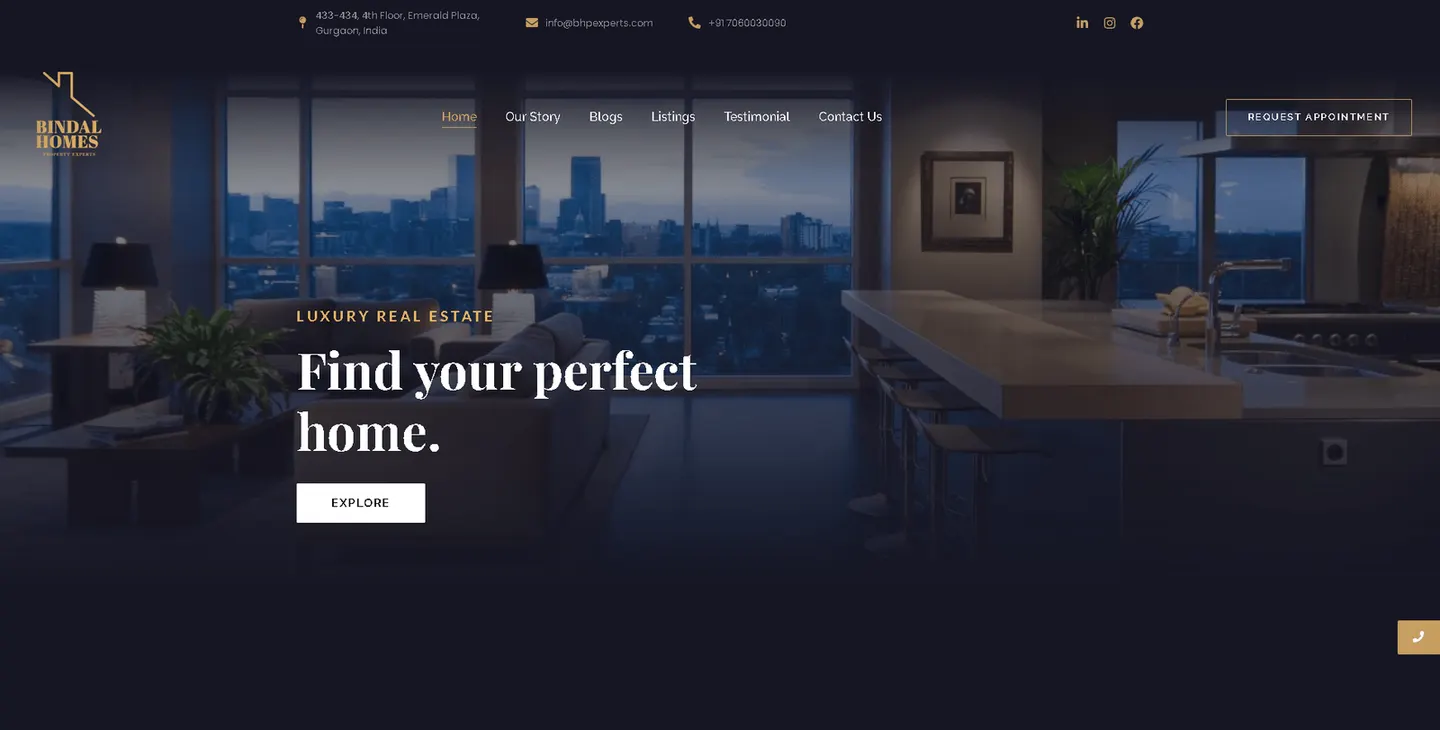
We started with the brand, then let the website inherit it. The goal was a visual language that reads as high-end property at a glance: a deep navy foundation, warm gold accents, and an editorial serif that carries the same quiet authority as a printed brochure.
From there the structure followed the buyer. Rather than crowd the page, we built the journey around two things a serious prospect actually wants — to see the homes, and to arrange a viewing — and kept the invitation to book present the whole way down.
03
The Solution
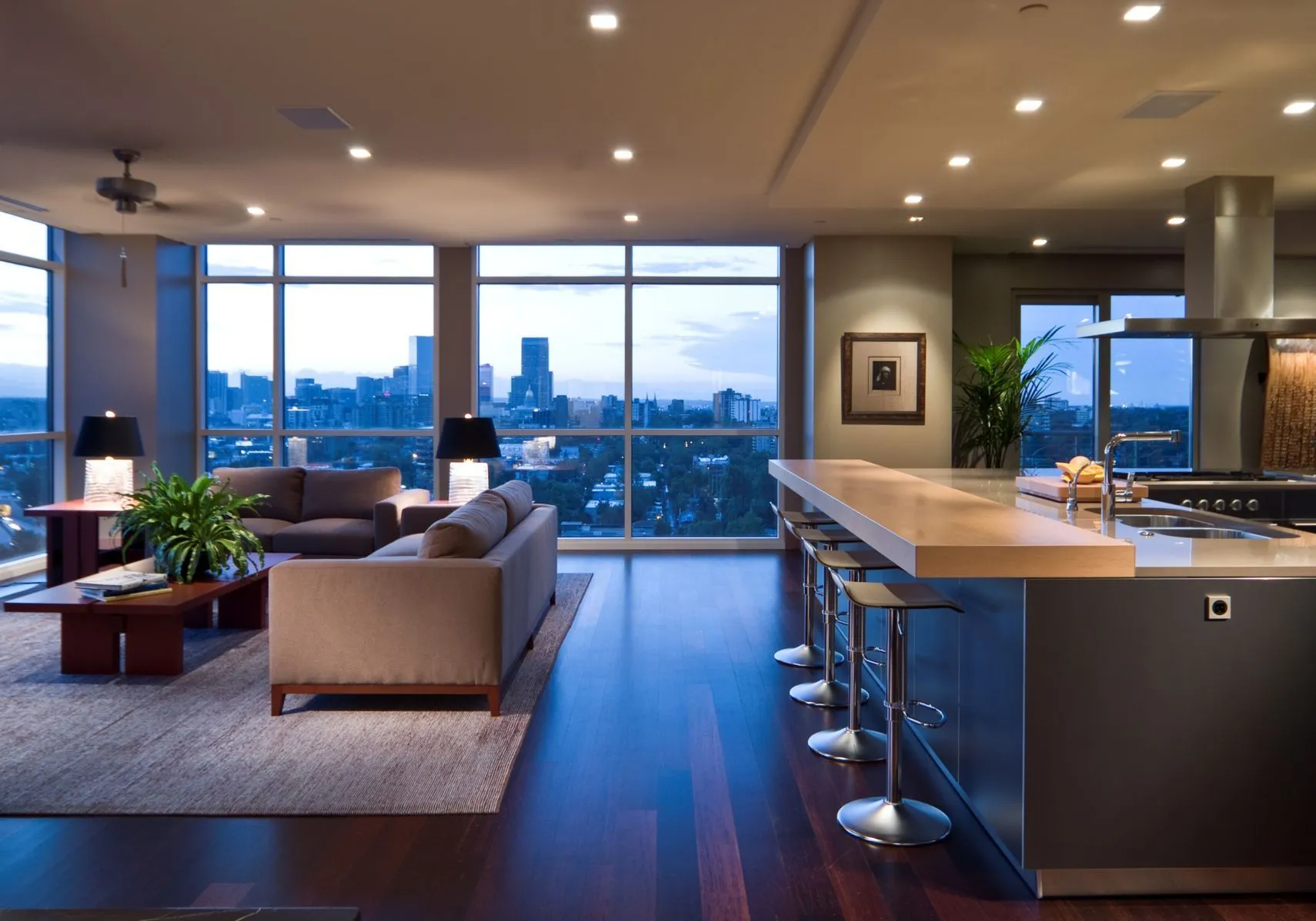
The homepage leads with the promise the brand is selling — Find your perfect home — set over a dusk interior that lets the lifestyle do the talking. Navigation stays deliberately short: Listings, Our Story, Testimonials, Contact. A gold Request Appointment button holds its place in the header so the path from interest to enquiry is never more than a glance away.
The same identity carries beyond the site into the brand's advertising and marketing, so a prospect who meets Bindal Homes in a feed and again on the homepage sees one coherent, considered brand rather than two.
04
The Impact
Bindal Homes came away with a property brand that behaves like one — a design system that holds together from the logo to the listings to the ad creative.
-
An identity that signals the tier. Navy, gold and editorial type do the positioning work before a single price is shown.
-
A site built to convert interest into viewings. Short navigation and an ever-present appointment prompt keep the whole experience pointed at one action.
-
One brand across every touchpoint. The website and the marketing share a single visual language, so the firm looks as consistent as it is premium.

Collaboration
Got a project?
Let's talk.
We're a team of creatives who are excited about unique ideas and help companies to create amazing identity by crafting top-notch UI/UX.